Posts tagged as:

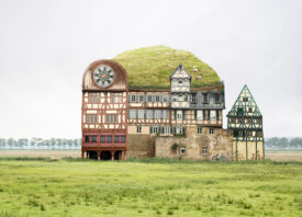
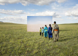
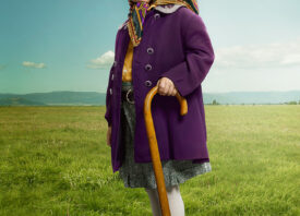
conceptual photography

elizabeth_renstrom_Photography

I wanted to investigate the icons we associate with girls to discuss why we assign these symbols in the first place. I wanted to place familiar things like horses, dolphins, and the color-soaked creations of Lisa Frank into the small bouts of real estate girls can make their own growing up. That’s why there’s a lot of locker school supply action going on—it’s thinking about the tools we’ve been given to express ourselves and how they look in different environments.—Elizabeth Renstrom

While she wouldn’t call them autobiographical, Brooklyn-based Elizabeth Renstrom’s photographs in Lisa Frank Blues are a captivating testament to her experiences as a preadolescent girl in the 1990s and early Y2ks. Renstrom’s tableaux of sticker-adorned cell phones and all things pastel are a glimpse into the complex machine of girly, pre-teen pop culture. Press-on nails, JTT, and Lisa Frank pencils gave girls in the 90s a way to relate to one another—a medley of sentimentality and cult-value.

elizabeth_renstrom_Photography

elizabeth_renstrom_Photography

elizabeth_renstrom_Photography

lisa-frank

elizabeth_renstrom_Photography

This post was contributed by photographer Lisa Gonzalez.

Kyoko_Hamada_Photography

When I first tried on her gray wig, the latex makeup, and her clothes, I gazed at the mirror for a long time. My initial reaction was to chuckle, but I started feeling a little uneasy soon after. The wrinkled face staring back at me resembled my own with thirty-plus years added to it. When I smiled, she smiled back at me. When I pouted, she pouted too.

It was the first time I had met her, but she was simultaneously someone I already knew quite well and someone I knew nothing about. It has been a year and half since I started photographing Kikuchiyo-san and I have gotten used to dressing up as her. However, when I think of what could happen if we ran into each other in a crowded train station or during a walk in the park, I get uneasy imagining her say, “I used to be you.”—Kyoko Hamada

Brooklyn-based photographer Kyoko Hamada steps out of her comfort zone in her latest series I Used to be You. Her work often consists of ordinary people and objects that she stages into quiet moments that explore various metaphors, but this time around Hamada turns the camera on herself to capture Kikuchiyo-san, the future version of herself. The series was born after Hamada spent time volunteering as a visitor to various seniors in NYC. When she discovered that none of the seniors she was working with were interested in being photographed, she decided to experiment on herself. The project turned into an exploration of aging, memory, and the different phases of life.

Kyoko_Hamada_Photography

Kyoko_Hamada_Photography

Kyoko_Hamada_Photography

Kyoko_Hamada_Photography

Kyoko_Hamada_Photography

Kyoko_Hamada_Photography

Kyoko_Hamada_Photography

Kyoko_Hamada_Photography

Kyoko_Hamada_Photography

Kyoko_Hamada_Photography

Kyoko_Hamada_Photography

Feature Shoot Contributing Editor Julia Sabot is the Associate Photo Editor at Dwell.

Mauren_Brodbeck_Photography

For Mauren Brodbeck’s series “Urbanscape and Cityscape”, she photographed buildings in both Los Angeles (where she was living) and Geneva (where she grew up). Brodbeck looks at buildings as if they are sitting for a portrait. “The idea is to photograph building as though they are people. That way, they become portraits of the cities where they are located. In this series, I am looking for subjects that have a real structural geometry. Buildings are a kind of mirror of society. I find the repetition and rhythm of architecture is associated with human rhythms such as habits and rituals. We are all really such creatures of habit.”

To determine the colors for the buildings, she uses the colors of the location or the colors of the season. “I am inspired by the colors of the place and the seasonal colors which can really change the feel of the pictures. I start by using the color palette of the area or the persona. Then I create my own color palette based on the original color. That maintains the authenticity at the base of the work.”

Mauren_Brodbeck_Photography

Mauren_Brodbeck_Photography

Mauren_Brodbeck_Photography

Mauren_Brodbeck_Photography

Mauren_Brodbeck_Photography

Mauren_Brodbeck_Photography

Feature Shoot Contributing Editor Carolyn Rauch is the Deputy Director of Photography at Newsweek.

Zeiss

Steven_Brahms_Photography

I made eight photographs of different men in my neighborhood. I gave each man a hand-gun and asked him to make an action pose. In our contemporary state of affairs every action is a performance. We are inundated with an endless repetition of imagery. We find ourselves re-watching what we have already seen, whether it be another episode of CSI or the endless 24-hour news cycle of conflict around the globe. We are constantly looking at the same picture: a guy with a gun.

The images of incidents we witness reveal nothing about what is actually happening. There are multiple truths attached to every image we see. Actions are interpreted and each interpretation is different because in the telling and re-telling we don’t reveal the action itself, but rather an assortment of reductions and emphases.—Steven Brahms

Violent Material, a project by New York-based Steven Brahms, explores more than the violent gun culture that exists today, but also how our vernacular imagery is generated and undermined through process and interpretation—a topic that questions the role photography plays in how we understand our world, accurately or not.

Steven_Brahms_Photography

Steven_Brahms_Photography

Steven_Brahms_Photography

Steven_Brahms_Photography

Steven_Brahms_Photography

Steven_Brahms_Photography

Steven_Brahms_Photography

This post was contributed by photographer Mark Hartman.

Justin_Fantl_Photography

One of the amazing things I have found is that you can create depth, and create perception with color alone. It seems obvious, but as I dig deeper it becomes more and more profound, and strange in ways. I think that painters deal with this issue all the time, but as a photographer, it isn’t always as obvious. I suppose part of my thinking is that if you can perceive millions of shades of color with just the red, green and blue receptors we have, you can create a possibly endless body of work by just using basic combinations of colors.—Justin Fantl

For 5 years now, Los Angeles-based photographer Justin Fantl has experimented with color strictly by using paper to play and expand on ways of seeing and constructing. The result? Beautiful and abstract images that create graphic optical illusions.

Justin_Fantl_Photography

Justin_Fantl_Photography

Justin_Fantl_Photography

Justin_Fantl_Photography

Justin_Fantl_Photography

Justin_Fantl_Photography

Justin_Fantl_Photography

Justin_Fantl_Photography

Justin_Fantl_Photography

Feature Shoot Contributing Editor Julia Sabot is the Associate Photo Editor at Dwell.

Ofer_Wolberger_Photography

For his series Crumpled Paper, Brooklyn-based photographer Ofer Wolberger took images from the pages of fashion magazines. He folded, crumpled, taped and lit them from behind, allowing the photographs to morph both sides of the page. The project was used to re-conceive and re-explore the idealized images of beauty found in women’s magazines. In some cases, the models’ faces become distorted and even grotesque, causing us to consider a different perspective on beauty.

Ofer_Wolberger_Photography

Ofer_Wolberger_Photography

Ofer_Wolberger_Photography

Ofer_Wolberger_Photography

Feature Shoot Contributing Editor Carolyn Rauch is the Deputy Director of Photography at Newsweek.

Zeiss

winona

When I saw Winona Barton-Ballentine’s Home Studies prominently displayed in the ICP-Bard MFA group show, currently on view at ICP’s midtown educational center, I immediately felt drawn to their obvious sincerity and consideration. In a climate where combining random objects for no particular reason on a brightly colored background seems de rigueur, Barton-Ballentine’s domestic still-life photographs offer a warmly personal alternative. I recently asked her a couple of questions about the series.

The ICP-Bard MFA group show is on view through May 9th, 2013. Barton-Ballentine’s work can also be viewed in the group show Secession Secession, curated by Colby Bird at Fitzroy Gallery in NYC.

Winona_Barton-Ballentine_Photography

How did you begin working on Home Studies?
“I was living in Arles, France for two months while doing a residency/exchange, and stayed at home making still-lifes all day, listening to music, looking at maps, and experimenting with French recipes. That’s when food, fabric, and domestic items came into the pictures.

“I was thinking about objects that I choose to surround myself with in America versus what I was attracted to in France where I bought things to satisfy that anxiety of being away; to try to create a sense of home. This often included things from the market and/or things that reminded me of my Lebanese and French Canadian grandmothers—both amazing cooks.

“Back in Brooklyn, part of my system for making these images was to only use objects that already existed in my home as a way to challenge the desire to consume, and to ween myself away from the mindset that to buy something meant that I would make a better photo. Instead I wanted to make the things in the images.

“This felt important to me after years of working in fashion photography. I’m also considering the tradition of domestic craft, which both intrigues and terrifies me. I knit, cooked, chopped, sewed, strung, and constructed the images in a way that embraced the imperfection of the hand-made versus mass-produced. I often found this part to be slow and frustrating compared to the immediacy of photography. It was, however, satisfying in a physical, primary way.”

Winona_Barton-Ballentine_Photography

What do these photos mean to you?
“They represent this time in my life and in history, as a woman, a wife, an American, and an artist. With the abundance of new technologies, image-making styles, and production resources, I chose to re-visit the foundational tools of photography—framing, timing, and focus. This seemed a fitting framework for examining the history of domestic [still] life.

“I’m interested in the place where personal questions reflect the feelings of other people in my generation and cultural circumstance. There’s no better space for this than the home. Three questions arise: how does treatment of domestic space reflect circumstance? And beyond that: what conscious or unconscious decisions determine how I create my space, and why?”

Winona_Barton-Ballentine_Photography

Feature Shoot Contributing Editor Matthew Leifheit is an independent writer, curator, and photographer based in New York City.

beth_galton_Photography

This series was inspired by an assignment in which we were asked to cut a burrito in half for a client. Normally for a job, we photograph the surface of food, occasionally taking a bite or a piece out, but rarely the cross section of a finished dish. By cutting these items in half we move past the simple appetite appeal we normally try to achieve and explore the interior worlds of these products.
Beth Galton

Cut Food, a series by New York-based still life and food photographer Beth Galton, delivers an eye-pleasing, intriguing new look at what we eat. A collaboration with food stylist Charlotte Omnès, the duo worked meticulously to showcase the dynamic cross sections, each one differing in level of difficulty to achieve. Some items looked great being cut in half without any manipulation—the donuts and ice cream, for example—while others proved to require some of Omnès’ handy styling tricks—like using gelatin to solidify liquid in the soup cans.

beth_galton_Photography

beth_galton_Photography

beth_galton_Photography

beth_galton_Photography

Zeiss

William_Mebane_Photography

Legendary photographer Harry Callahan’s routine was to go out and make new photographs every day, whether or not there was anything in particular he wanted to shoot. Adopting this method, Brooklyn-based photographer William Mebane uses his new blog Villeburg as a tool in his photographic process.

A repository for great images that don’t exactly fit into a series, the photos on Villeburg are nonetheless very carefully edited and sequenced—Mebane describes it as “a place where I can share my process with friends and work on editing and pairing photographs that might fit into future projects. It’s an outlet for work that I’ve been making on a daily basis.”

William_Mebane_Photography

William_Mebane_Photography

William_Mebane_Photography

William_Mebane_Photography

William_Mebane_Photography

William_Mebane_Photography

William_Mebane_Photography

William_Mebane_Photography


Feature Shoot Contributing Editor Matthew Leifheit is an independent writer, curator, and photographer based in New York City.

Thomas_Albdorf_Photography

In his new series Former Writer, Part 1: Colour on Surface, Vienna-based photographer Thomas Albdorf builds on his past as a graffiti writer. By making blunt spraypaint interventions both in the real world and in his studio, he bends space and creates fluorescent visual play. In the vein of John Divola’s Zuma series, Albdorf physically marks his subject as evidence of his involvement. Part two of the series, already in progress, will combine sculptures, drawings and prints, while bringing them into real space. Here is a punk rock approach to the contemporary photographic still life.

Thomas_Albdorf_Photography

Thomas_Albdorf_Photography

Thomas_Albdorf_Photography

Thomas_Albdorf_Photography

Thomas_Albdorf_Photography

Thomas_Albdorf_Photography

Thomas_Albdorf_Photography


Feature Shoot Contributing Editor Matthew Leifheit is an independent writer, curator, and photographer based in New York City.