Search this site
Eyeballs, Vaginas and Raves in Chicago: Matthew Leifheit Talks to Us About Vice’s Latest Photo Issue

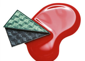
Photo by Michael Bühler-Rose
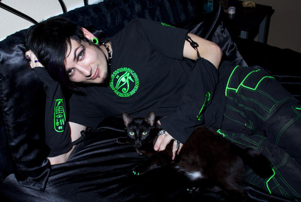
Photo by Cole Don Kelley
Every year I look forward to getting the Vice photo issue. If I could describe the issue in one word, it would be fresh: full of imagery I’ve never seen from (many) photographers I’ve never heard of. We don’t miss much here at Feature Shoot, and Vice always keeps it interesting. This year, with new photo editor Matthew Leifheit at the helm, is no exception.
I asked Leifheit a few questions about nudity, Terry Richardson, fruit topiaries and the opening party this Thursday night in Red Hook, Brooklyn.
This is your first year as the photo editor at Vice. How did you approach the curation for the photo issue?
“I went through a lot of different ideas when I first started thinking about the issue early this spring. I would take long lunches at Kasia’s, the Polish diner on Bedford Ave down the street from our offices, and fill a legal pad with (mostly bad) ideas while I slowly ate pierogies. I would come up with a theme, and think about whose work might fit, then list some names. To be honest I’ve been collecting Vice photo issues for years, so I’ve been thinking about what I might do differently if it were up to me in some capacity for quite a while.”

Photo by Thomas Albdorf
Tell us about the theme.
“In the end I decided on some kind of expanding of the art history term trompe l’oeil to mean any kind of visual trick, illusion or transformation. It seemed like a good excuse for fantastic imagery, lots of smoke and mirrors. Also, every photograph is an illusion in the sense that it is not actually that which it depicts, so it gave us a lot of freedom in terms of what photographs would work for the magazine.”

Photo by Peter Kaaden
Did you have any guidelines that you had to follow or were you given free reign to do whatever you wanted?
“There’s an amazing team of editors and designers and creative directors who deserve most of the credit for making the issue possible. But I can honestly say I like every photograph in the magazine and had my hands on each picture in one way or another. I was surprised and honored with the amount of trust the editorial team put in me, from coming up with the theme to choosing the photographers. The magazine’s Managing Editor, Ryan Grim, has a degree in art history, so although the theme may seem a little more ‘high art’ oriented than Vice photography issues may have been in the past, he definitely understood the potential from the beginning.
“There’s actually a funny story about this. After we’d (I thought) closed the magazine, I was on a train to Philadelphia, and the magazine’s Editor-in-Chief, Rocco Castoro, called me from Germany where he had gone for a conference. In Berlin, he had seen a series of pictures called Zu Nah by German photographer Peter Kaaden that he was excited about, and he insisted we find a place for them in the issue. They’re basically closeups of things that look like vaginas. I argued that the pictures were conceptually too simplistic, although I admitted that it could be a matter of personal preference (I’m gay). He said, ‘Well, the thing is, I really, really love vaginas.’ So we put them in! Ultimately I agreed it was a good call, and they’re actually some of my favorite pictures in the issue.”

Photo by Jason Nocito

Laurie Simmons: ‘How We See/Look 1/Daria’, 2014, pigment print, 70 x 48 inches, 178 x 122 cm. Courtesy of the artist and Salon 94
Is there something in particular you were looking to achieve with this issue? It seems there is more fine art photography (and less nudity) than in issues past.
“Well, I like nudity as much as the next guy. But my understanding of photography comes from an art background; I went to art school (RISD). I think the best photographs are Art, regardless of their original intent. I subscribe to a particular lineage that comes largely from people like John Szarkowski, where the documentary properties of photography are highly revered. I like pictures of things happening, or not happening. Although some people in the issue like Laurie Simmons would classify themselves as artists using photography rather than photographers, I really subscribe to photography for photography’s sake.
“Photographs are always the subjective opinion of the photographer, and I guess that’s what I was trying to get across with the issue. I think people need to look harder, to scrutinize images, and not take them at face value or trust them as documents.”

Cindy Sherman: ‘Cover Girl (Vogue)’, 1975/2011, three gelatin silver prints, 10.5 x 8 inches, 26.7 x 20.3 cm (each image size), 19.125 x 16.625 inches, 48.6 x 42.2 cm (each frame size), edition of three. Courtesy of the artist and Metro Pictures, New York
You have a great mix of photographers all all levels of their careers in the issue. Lesser known works by Cindy Sherman and Weegee are presented alongside work by more emerging photographers. How did you go about deciding who to include?
“The point of the issue is really to promote the work of young photographers. But it benefits both parties if famous people are included alongside them. The bigger names generally contributed only a few pages, like a blessing for the emerging artists. When I started thinking about whose work would fit the theme, I drew upon studio visits I’d made in New York and critiques I’d attended at Yale and SVA and Parsons and ICP and so forth. I think it’s really important to see work in person, to meet the people who make it, and to talk to them about what they’re trying to accomplish. So I go to a lot of shows and I talk to a lot of photographers.
“Many of the artists in the issue are people I discovered through the magazine I self-publish, Matte. Some have been featured in previous issues, and others are working on issues that will come out soon. Publishing my own magazine about photography has given me a reason to pay close attention to emerging photography for about three years now, long before I was got this job at Vice.”

Weegee (darkroom distortion) Courtesy of the International Center of Photography/Getty Images
Many of the photographers made work especially for the issue. How does that process work? Was that nerve racking not knowing what to expect and whether you’d like it or not?
“It was kind of an exciting constraint — the photographs we presented in the issue had to be new in a certain way; we had to be debuting them rather than showing people something they’d already seen. This can be problematic in terms of young photographers, because it has become an essential part of many peoples’ practice to release photos onto digital platforms like Tumblr as soon as they’re made.

Photo by Cole Don Kelley
“In any case, some of the artists in the issue, like Cole Don Kelley, had work they’d been making in secret, waiting for the right opportunity to release them into the world. Other people had ideas for new work they’d like to make. I was never worried about the outcome, because I was only working with people who I trusted absolutely. I was also fortunate to be able to work with artists on their contributions. For example, Pierre Le Hors had me over to his studio one afternoon, and he’d delicately taped photos to the wall for me to look at. I liked the presentation so much, he photographed the walls and we reproduced them to scale in the magazine.”
There are many new photographers included and some Vice staples like Richard Kern. No Terry Richardson though….?
“HAH. Yeah, Terry is a hot topic lately. I’ve never worked with him before, although I hear he’s a nice guy. His work didn’t come to mind when I was thinking about the theme, so it never occurred to me to call him up.
“Richard Kern is someone whose work I’ve admired for a long time, so when I stepped into this role it was really exciting to be able to work with him regularly. He has photographed actually everybody, so when I need to find a picture of someone, I check if Kern has shot them first. His work is hedonistic and subversive and just fun to look at. What more do you want in a photograph?”

Photo by Zak Arctander
The Haven series photographed by Zak Arctander is very intriguing. What’s the story behind this work?
“Oh, I love those. Zak had been simultaneously photographing raves in Chicago and the Butterfly Haven in the city’s Nature Museum. He eventually decided to seamlessly splice them together. As Zak recently told writer Kyle Laidig in an interview for vice.com, ‘The haven is beautiful but also terrifying. Children damage the butterflies with improper handling or outright smash them under their feet. Having this room in a museum presents nature as separate and manipulable. I saw a connection where the approach to the world taught by the haven could relate to brazen experimentation with one’s mind as a teenager.'”

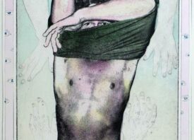
Photo by Cynthia Talmadge and Matthew Leifheit
You’ve included some of your ‘fruit topiaries’ still life work in the issue. Tell us about your collaboration with artist Cynthia Talmadge?
“Yeah, when Ryan McGinley and Tim Barber used to have my job, they both put their own work into the magazine. So I figured, why not?
“The series is something Cynthia and I have been working on for almost two years now. It started with big, excessive piles of greased up fruit, but recently we have started to move away from the fruit a little bit. The pictures in the magazine are this positive/negative process we’ve been formulating, where everything in a scene is painted the opposite color it’s supposed to be with gouache, according to an algorithm we’ve created. We then shoot it with both a negative and a slide, and show both as the final piece. There’s actually no photoshop used at all.”

Photo by Rose Marie Cromwell
I’m looking forward to seeing the show in person this Thursday in Red Hook. What’s to be expected at the opening?
“There will be great photographs to look at! What’s more the space is huge and beautiful, museum-sized. Pioneer Works is a nonprofit art foundation, the dream of Brooklyn artist Dustin Yellin. Some of the photographs with be printed very large scale. The magazine’s eyeball cover by Michael Bühler-Rose is going to be displayed 12 feet tall, watching over the exhibition. I’ve been very conscious to make the experience of going to the show different than the experience of seeing the photographs online or in a magazine. Some photographs are incredibly powerful to see in person, as an object. For example, the Hiroshi Sugimoto photograph that accompanied Bob Nickas’ foreword to the magazine is a nearly 50 x 60″ framed gelatin silver print that weighs 100 lbs. Seeing the work in person is very different than looking at a reproduction of the photo in the magazine.
“The exhibition will be on view for two weeks, and it will close August 10th at 6pm with a panel discussion between me, Magnum Photos Creative Director Gideon Jacobs, and a bunch of the artists in the issue. The conversation will revolve around truth in photography — I want to hear people who deal in photographs as fine art talk to people who deal in photographs as documentation or journalism. As Gideon told me on the phone this morning, ‘Let’s freak people out.’ I will also personally be at the space to talk to people about the exhibition on the weekends. I am interested in knowing photographers and talking about photography with people. Photography as a medium can oftentimes seem cold or morbid, but it’s this human element that keeps me invested more than anything else.”
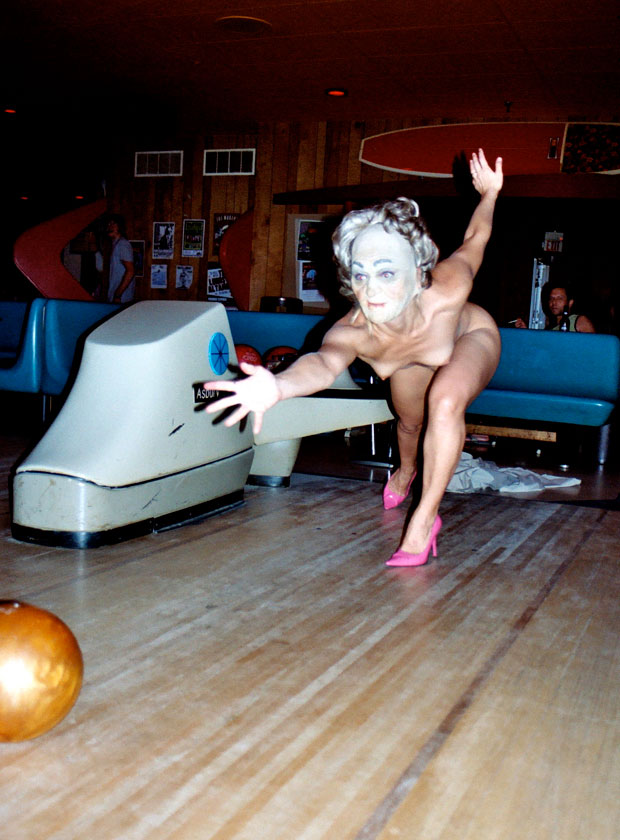
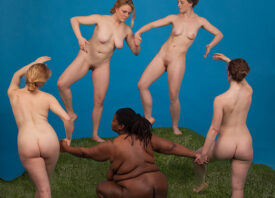
Photo by Robert Melee